Luckiefun’s
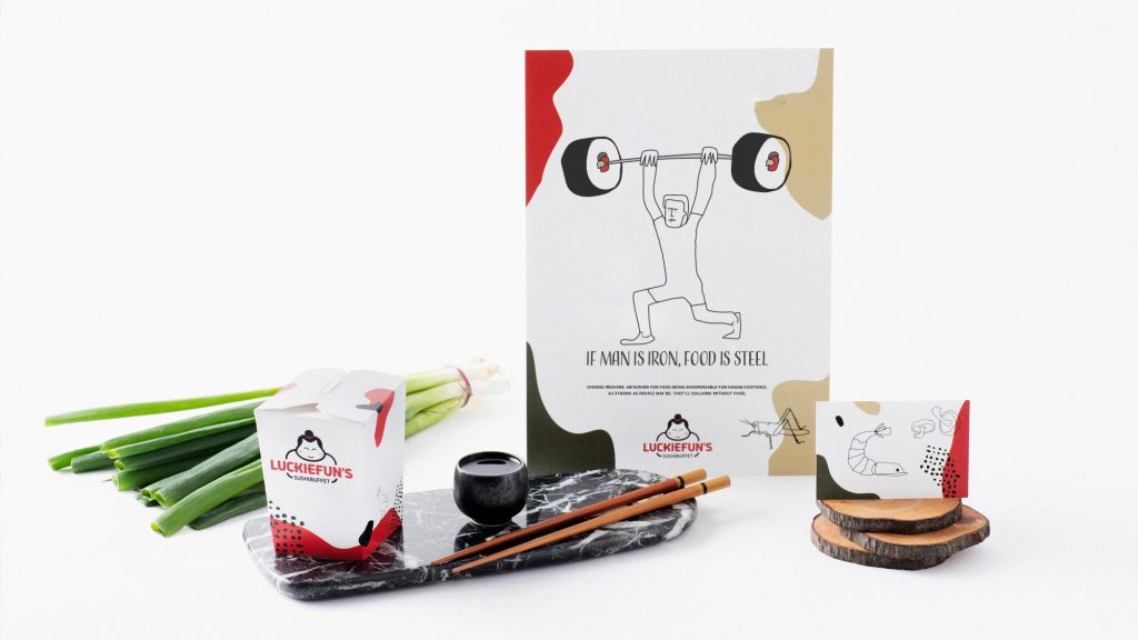
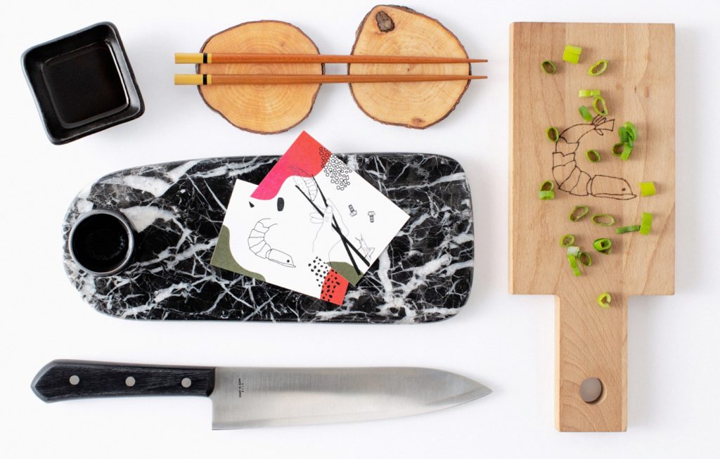
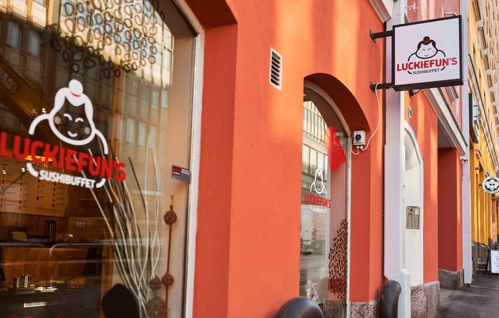
Luckiefun’s sushibuffet has conquered Finland by storm. Don & Branco helped Luckiefun’s find their identity by designing a new colorful look for their website and the restaurants, including everything from a new logo to restaurant interiors, window decals, employee clothing, packaging, menus and other products.
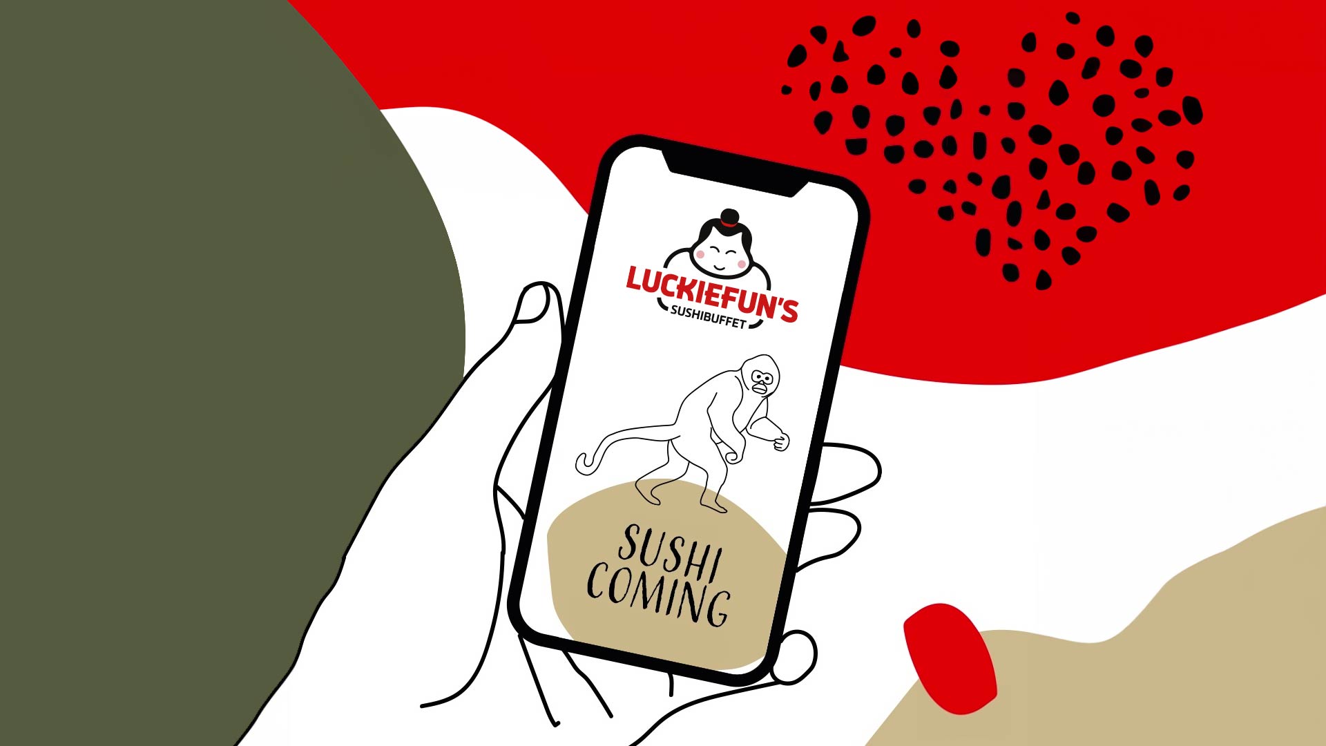
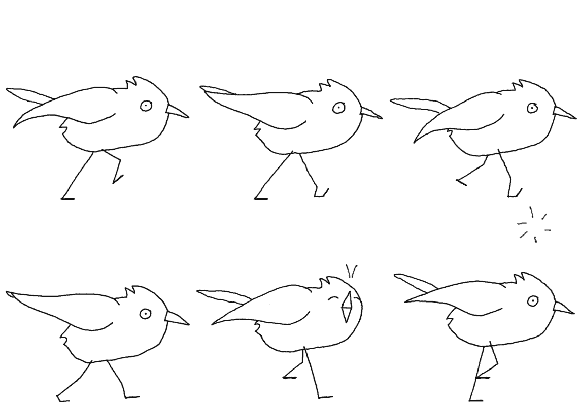
The colorful new identity is based on Asian proverbs. Cartoonish illustrations are rooted in tradition, but also refer to Japanese pop culture, keeping the atmosphere light and fun. A clear brand identity gives the chain’s restaurants a unified look.
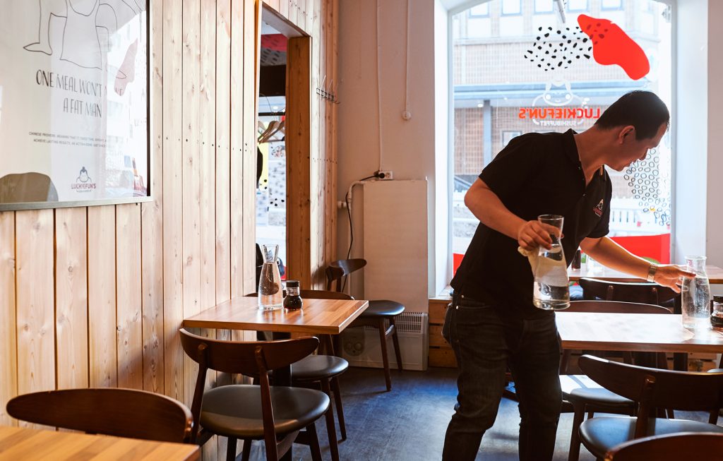
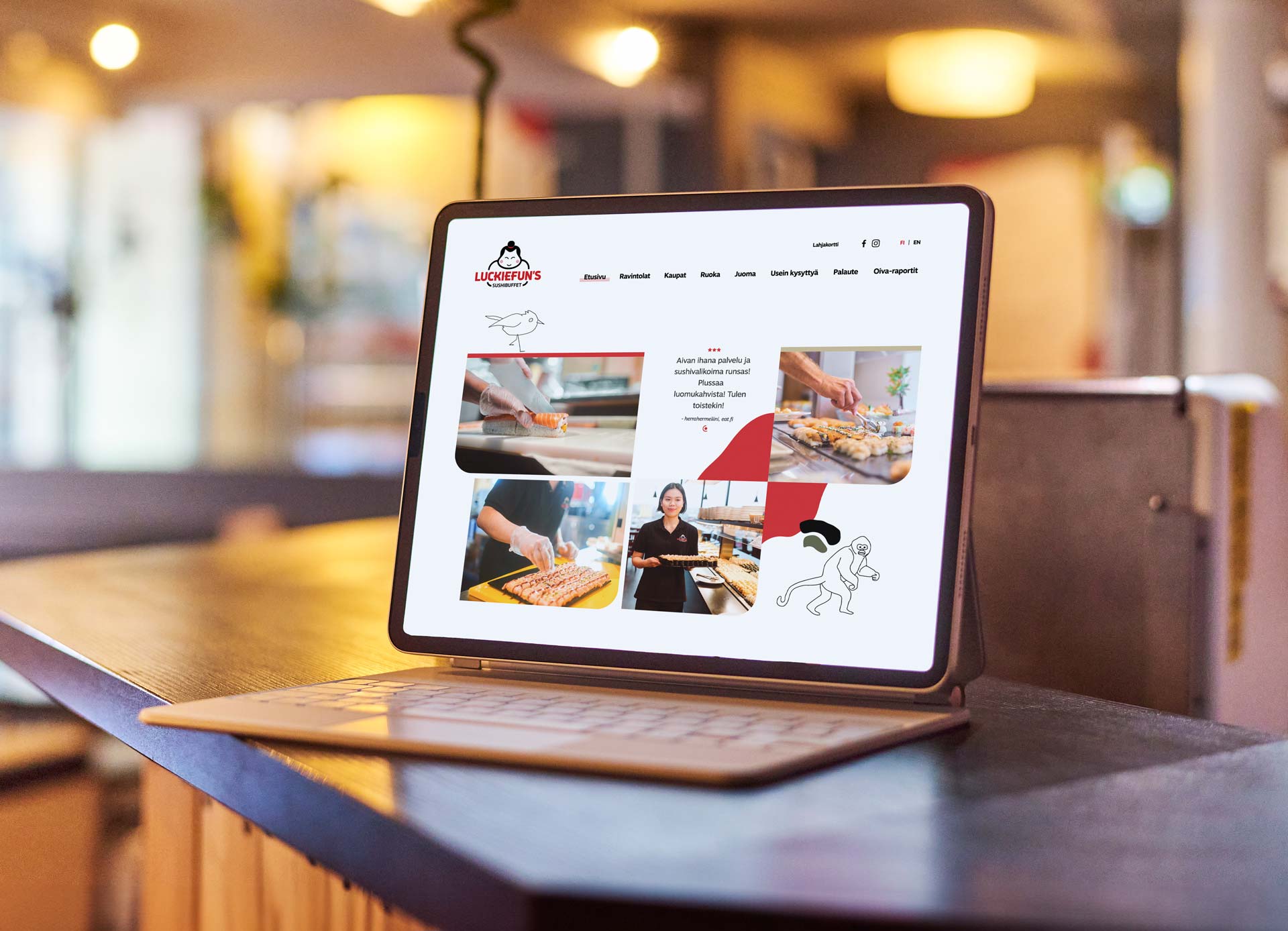
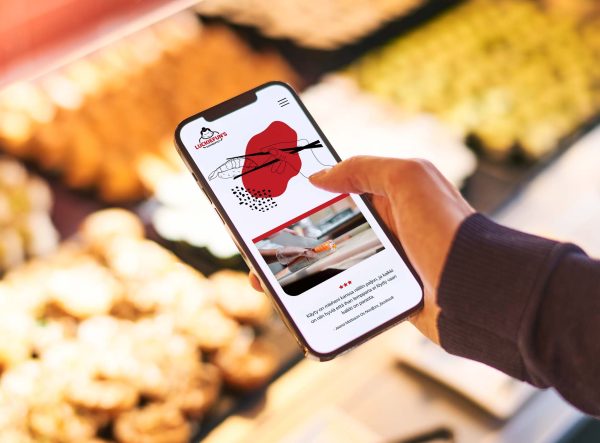
The new look brings the brand to life on the new website, which has been designed, developed and maintained by Don & Branco. We also manage Luckiefun’s social media content, bringing out the same fun style on all platforms.
Armed with the new identity, Luckiefun’s has become more successful than ever and many new restaurants have been opened during our collaboration.
Get in touch if you wanna know more about the reference:

More references
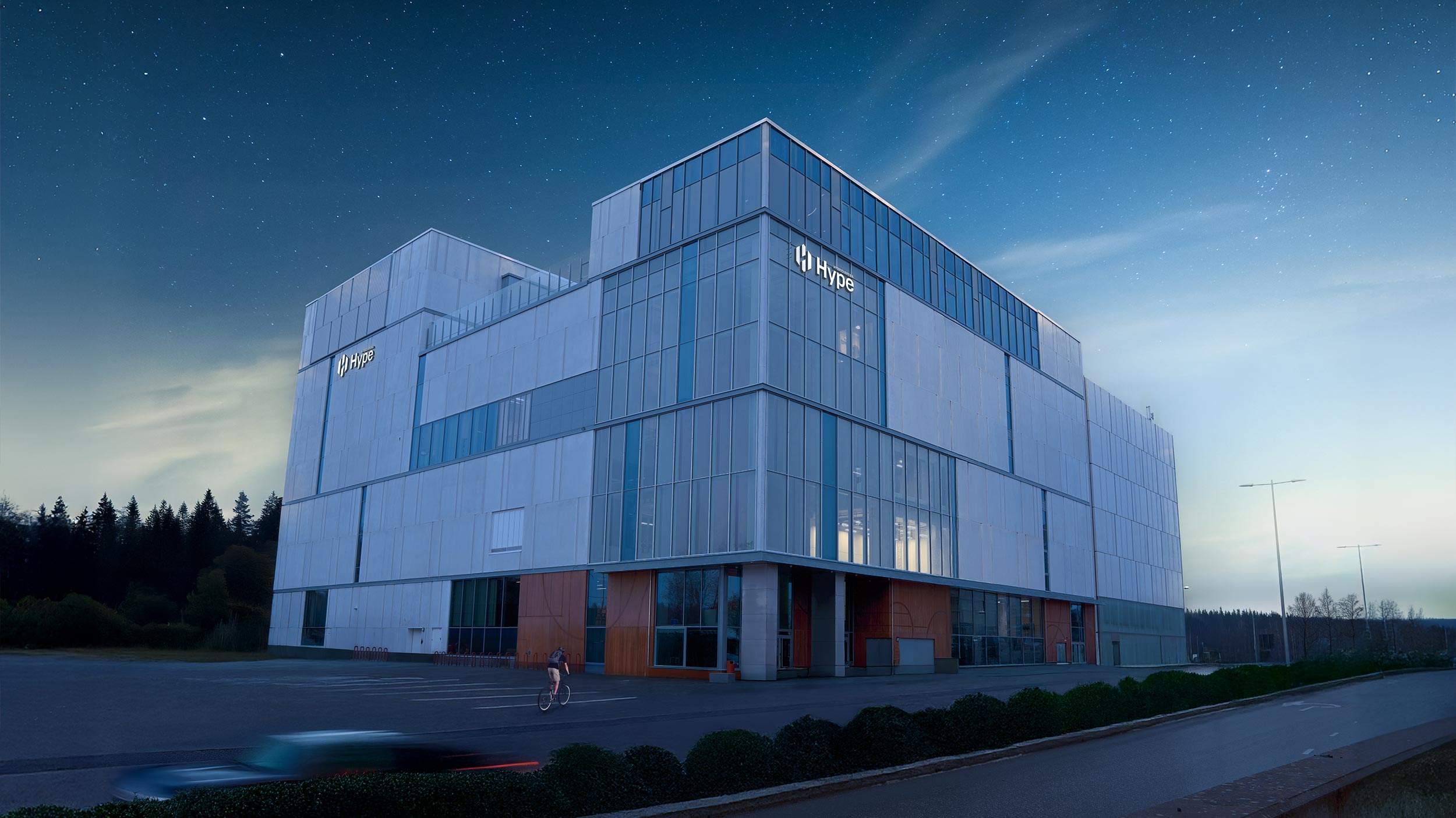
Hybridiarena Hype
Brand identity, marketing, website, booking calendar and online purchase platform for an experience arena in Espoo.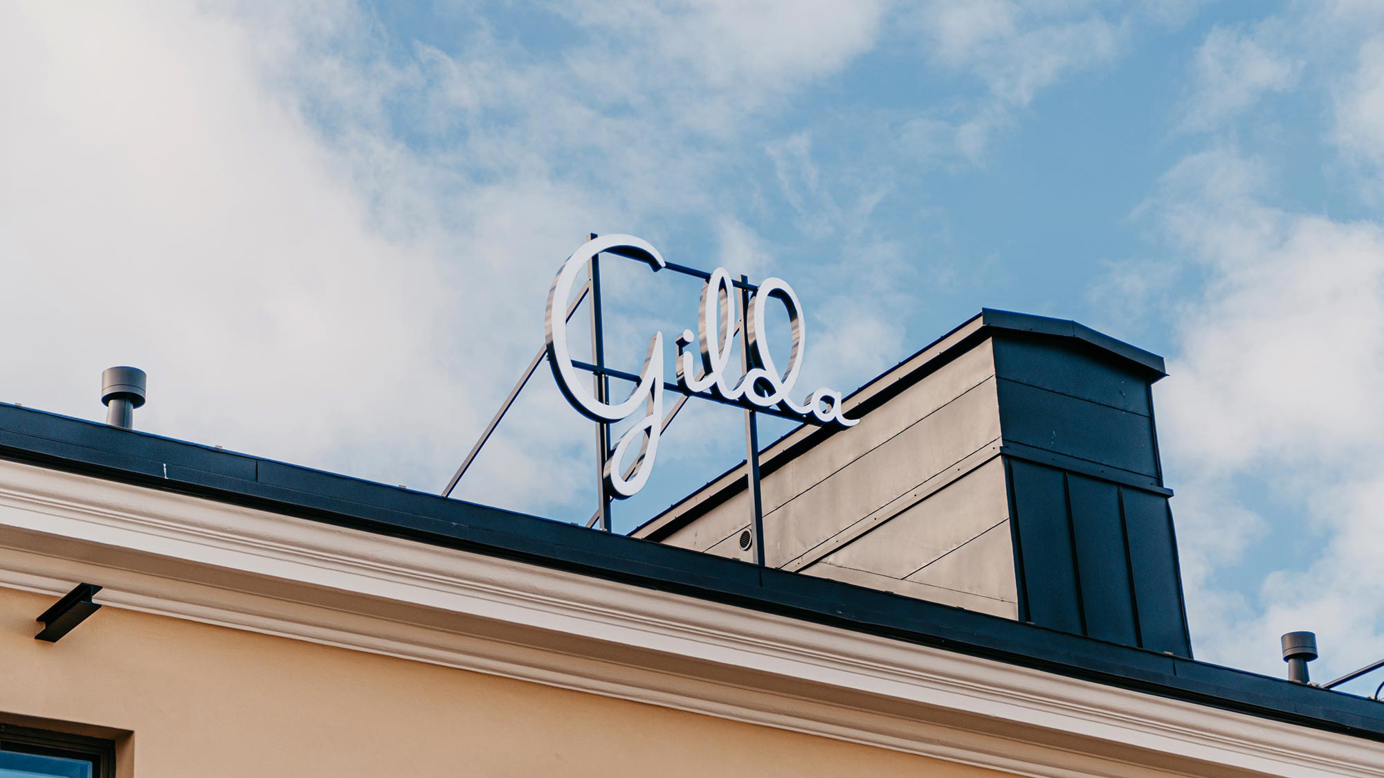
Gilda
Brand identity, website, ticket sales system and marketing for a movie theater.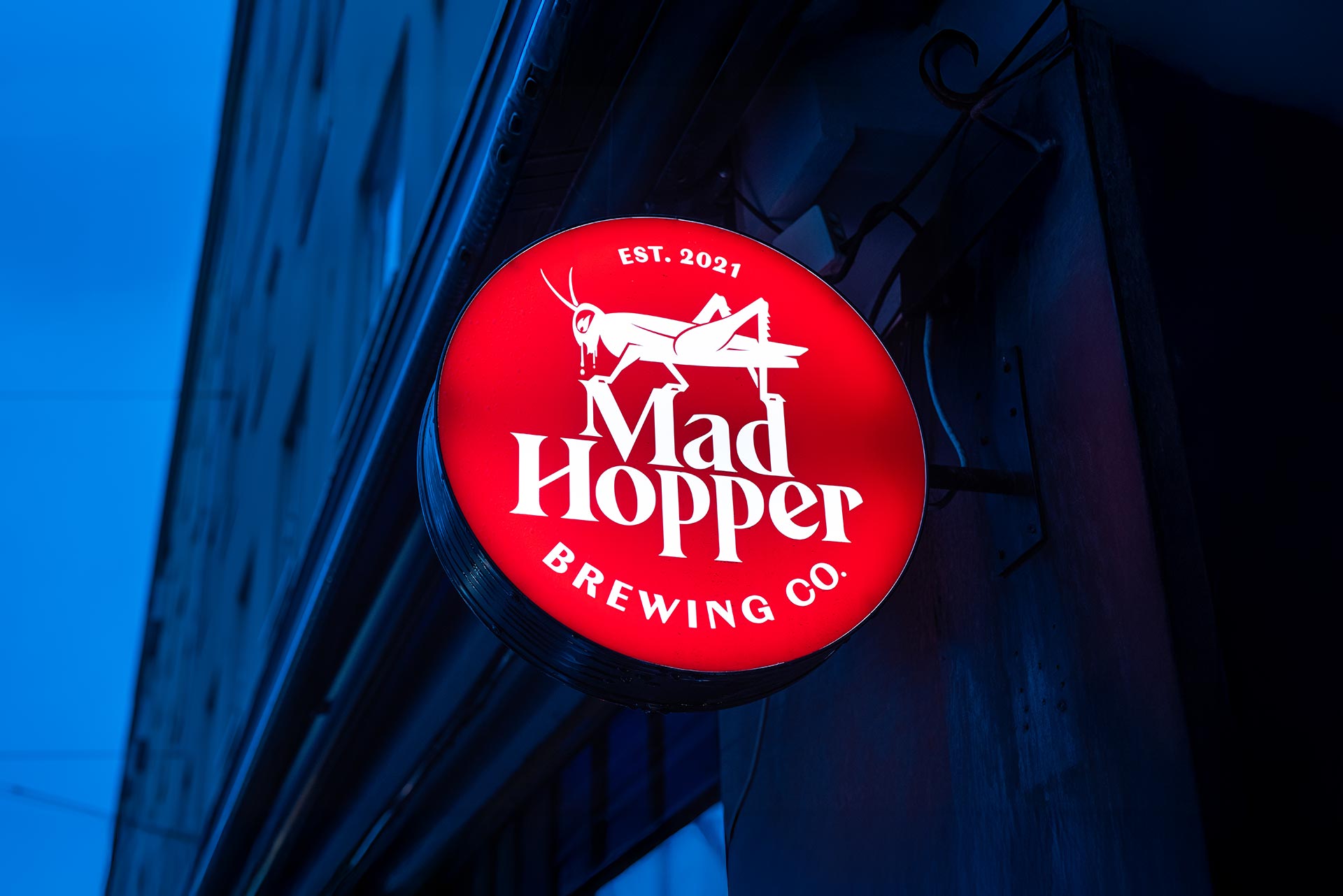
Mad Hopper
Brand identity, website and product launch for a brewery in Helsinki.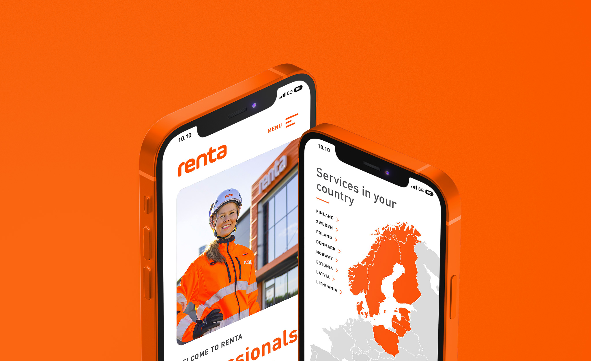
Renta
A multisite solution covering the sub-sites of the Nordic countries for a pioneer in the machine rental industry.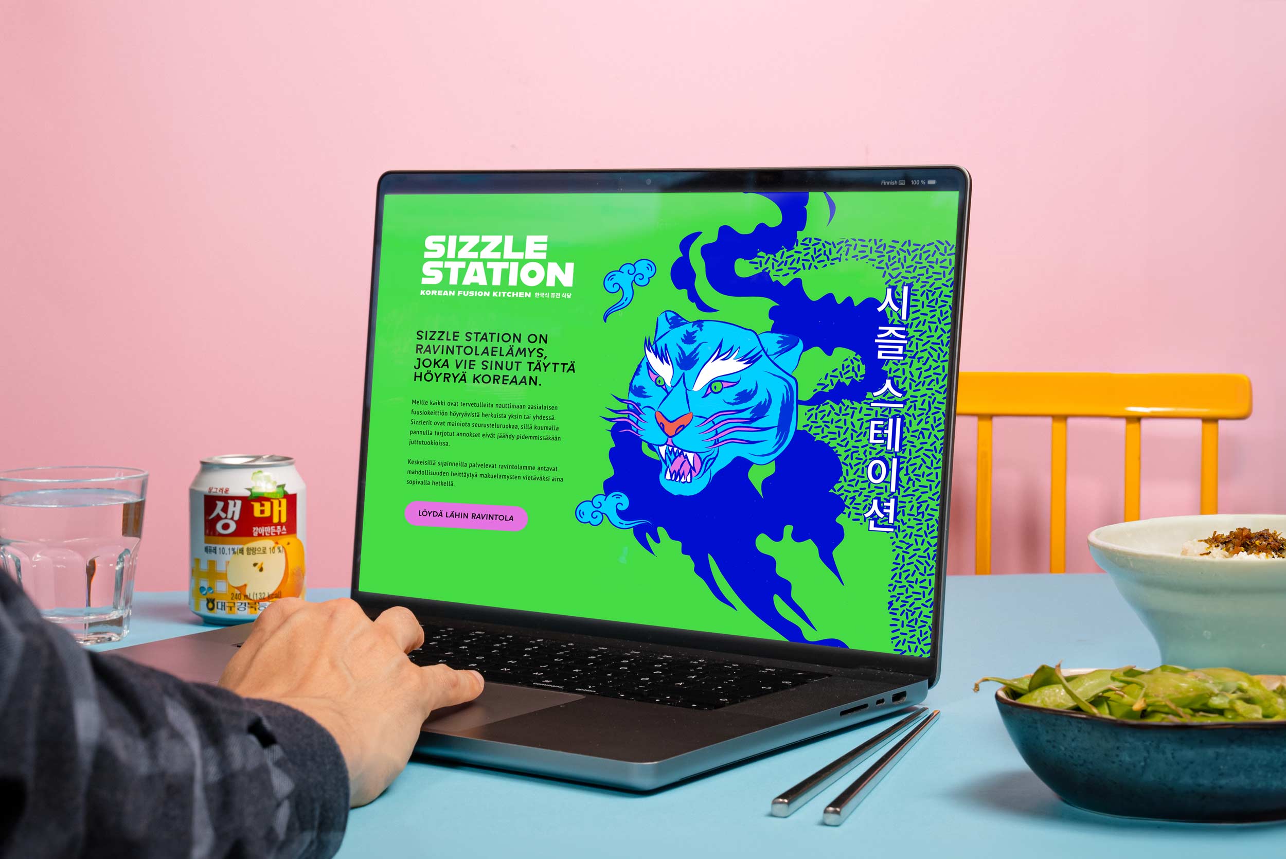
Sizzle Station
Visual and verbal identity for a popular Korean fusion kitchen restaurant chain.