Renta
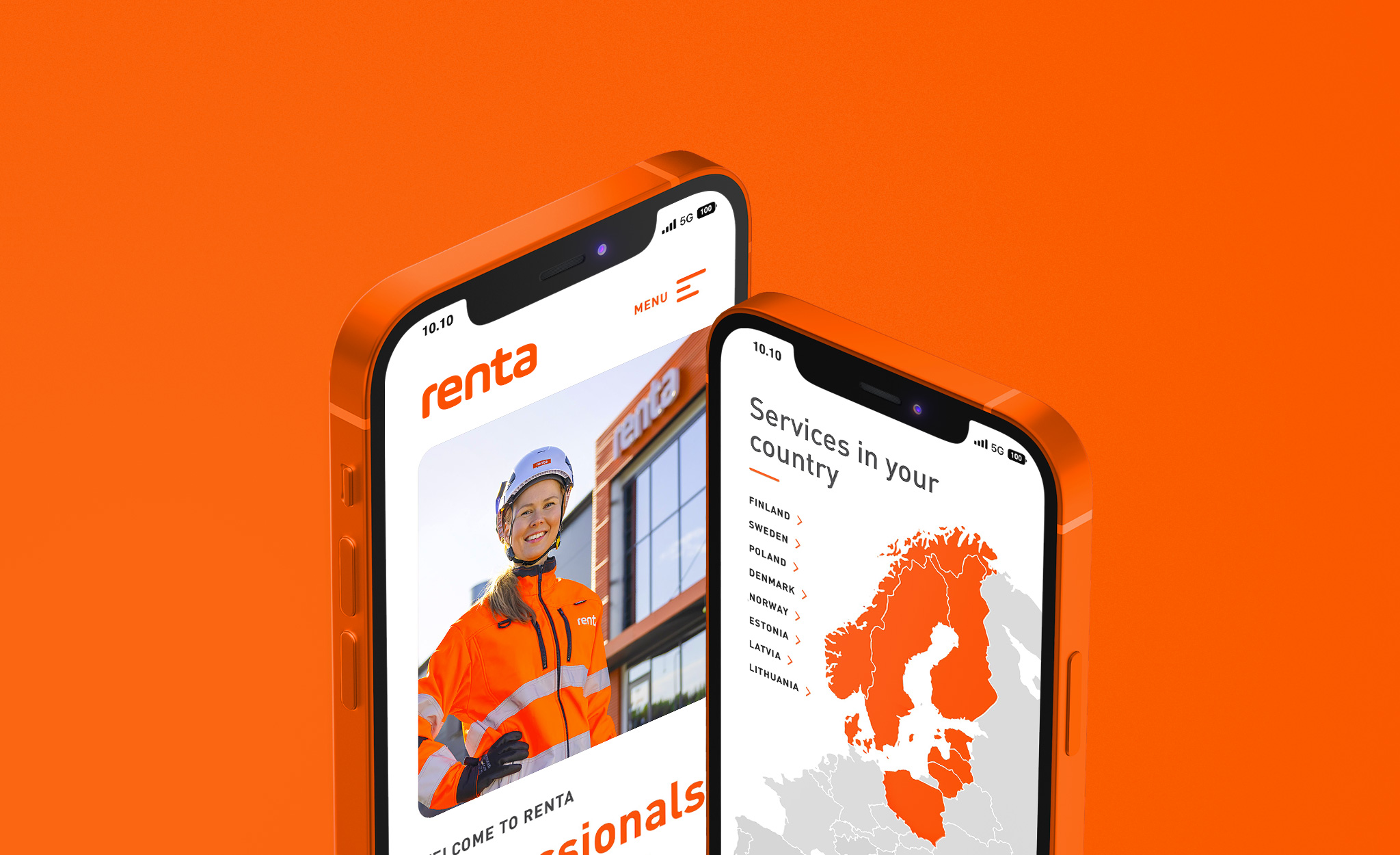
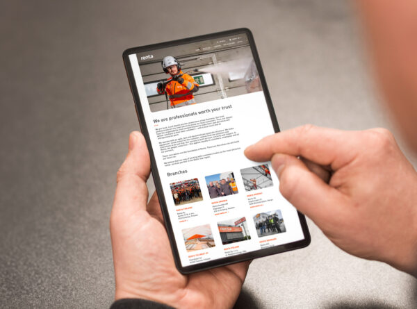
Having revolutionized the machine rental industry in a few years, Renta wanted to maintain its pioneer’s position in the future as well. The functionality of the online service and the ease of renting play a central role achieving this goal. We first renewed Renta Group’s website, after which we continued on the country-specific websites of the Nordic countries.
Challenge
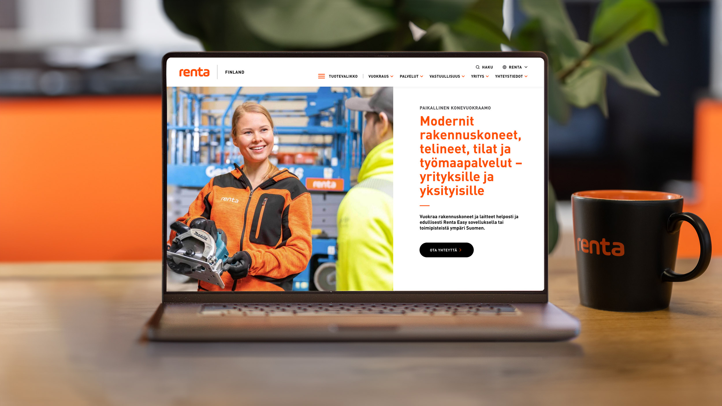
In recent years, Renta Group has expanded into a major machine rental operator covering Northern Europe, with more than 175 locations and 2 000 employees. With the rapid growth and digitalization of the industry, the needs of the online service have also changed. The goal of the project was to harmonize the different language versions, develop information security and bring the customer experience to the top level in the industry.
Solution
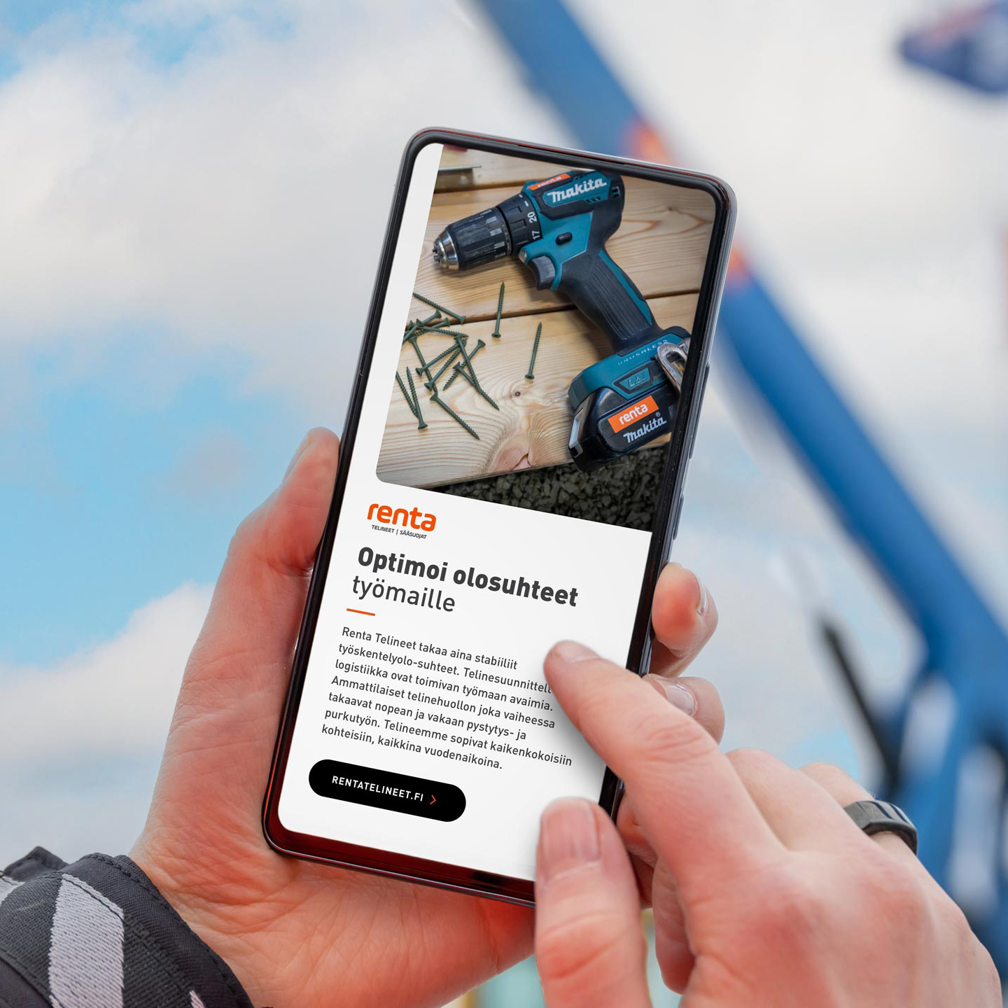
Careful service design highlighted the pain points of the online service, which we solved with UX and UI design. Customer experience was clarified with the renewed product selection and the ease of renting equipment through the online service.
We chose WordPress with the help of it’s Multisite solution we were able to implement Renta Group’s websites under one easy-to-manage environment with own language versions. The solution we chose also made it possible to open new country websites in the same environment without major coding work.
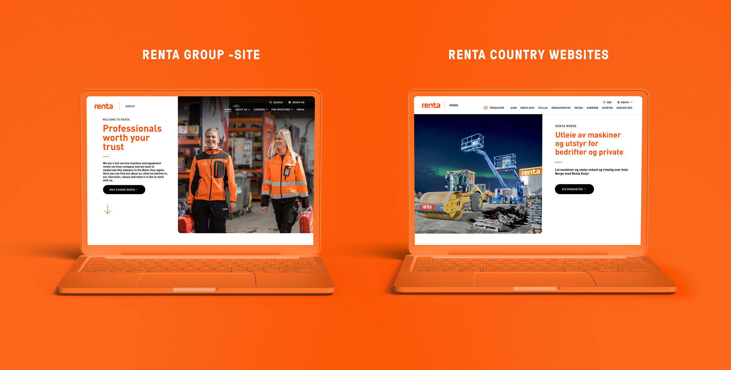
We integrated Renta Easy rental service’s product data on Renta Group’s websites. This enables up-to-date product data management from WordPress, as well as features for product marketing on the site.
Site maintenance is provided by Don & Branco. Our developers are able to make quick changes when the customer needs it, for example in terms of information security and other updates. When developing the website, we minimize information security risks by using only a few “core” add-ons, which generally have been found to have very few information security risks.
In the implementation, of course, we also took into account accessibility and usability on different devices, as well as readiness for digital marketing analytics and monitoring.
What changed?
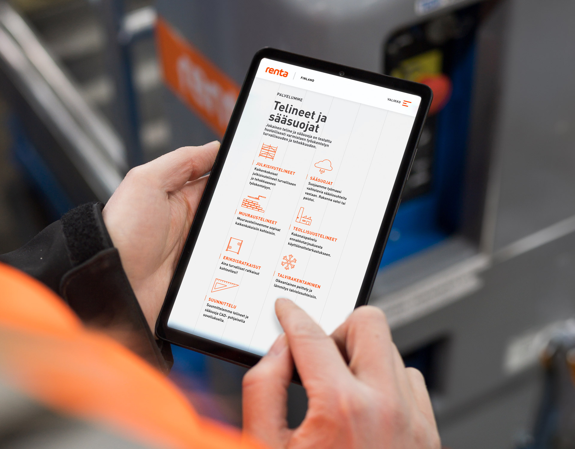
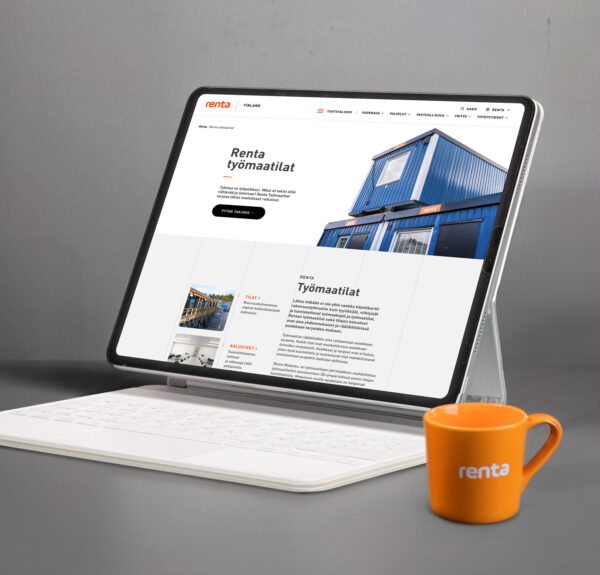
Renta Group and the country-specific pages now operate independently but supporting each other. Potential customers can now find what they need easier than before as the products and services have been separated into their own parts. Renta Group’s administrators can now manage the online service smoother than before in terms of content, products and new country websites.
As a result, both Renta Group and the country-specific subpages got a modern, reliable and customer-oriented online service that helps the customer not only find what they need but also understand the added value offered by a strong brand. And most importantly: a first-class service experience also provides a great foundation for the growth of the company’s business.
Get in touch if you wanna know more about the reference:

More references
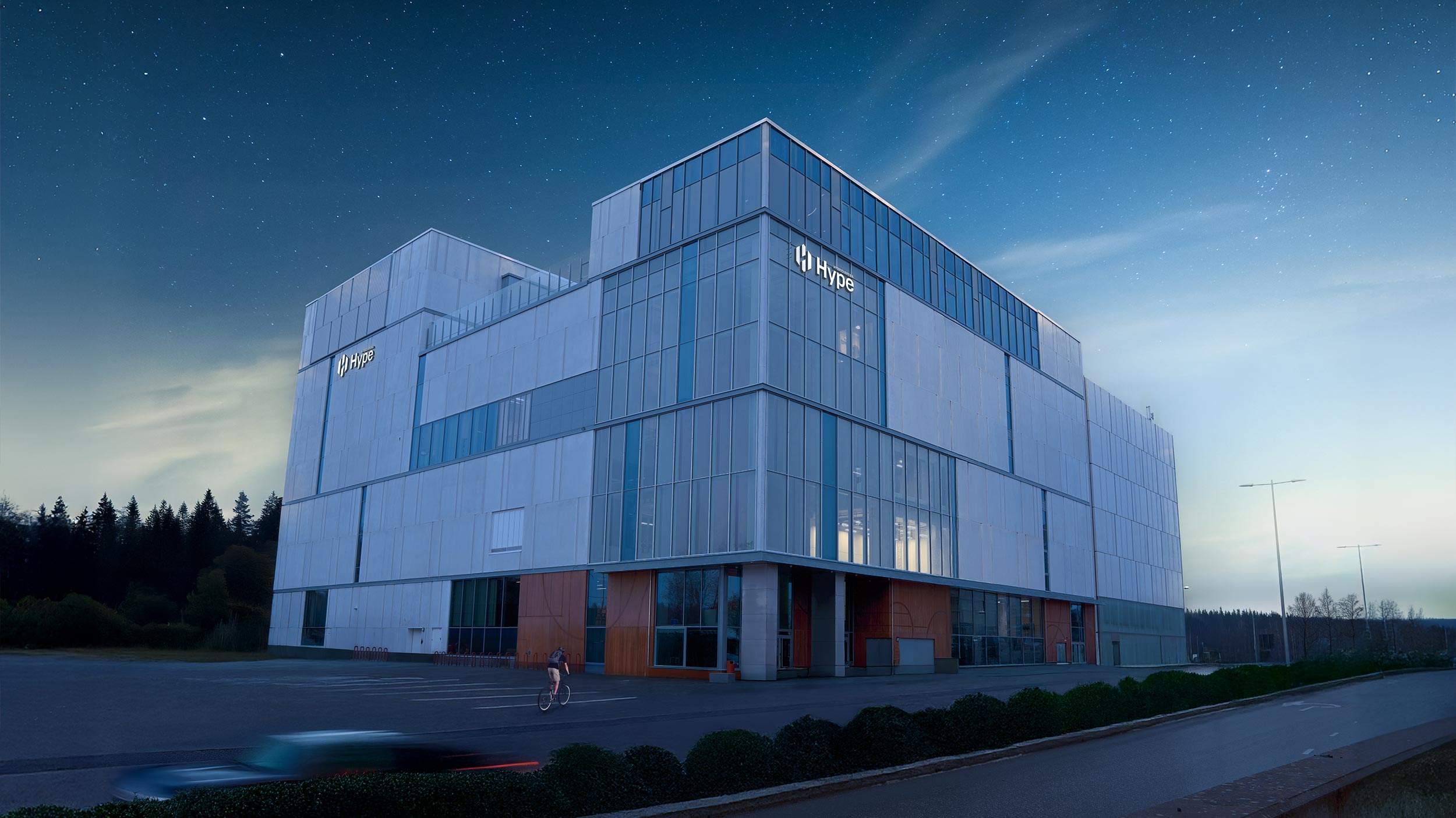
Hybridiarena Hype
Brand identity, marketing, website, booking calendar and online purchase platform for an experience arena in Espoo.
Gilda
Brand identity, website, ticket sales system and marketing for a movie theater.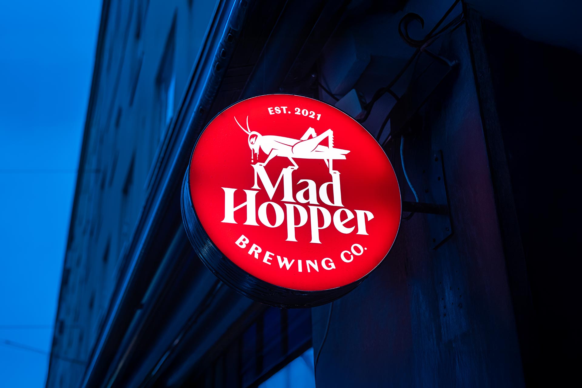
Mad Hopper
Brand identity, website and product launch for a brewery in Helsinki.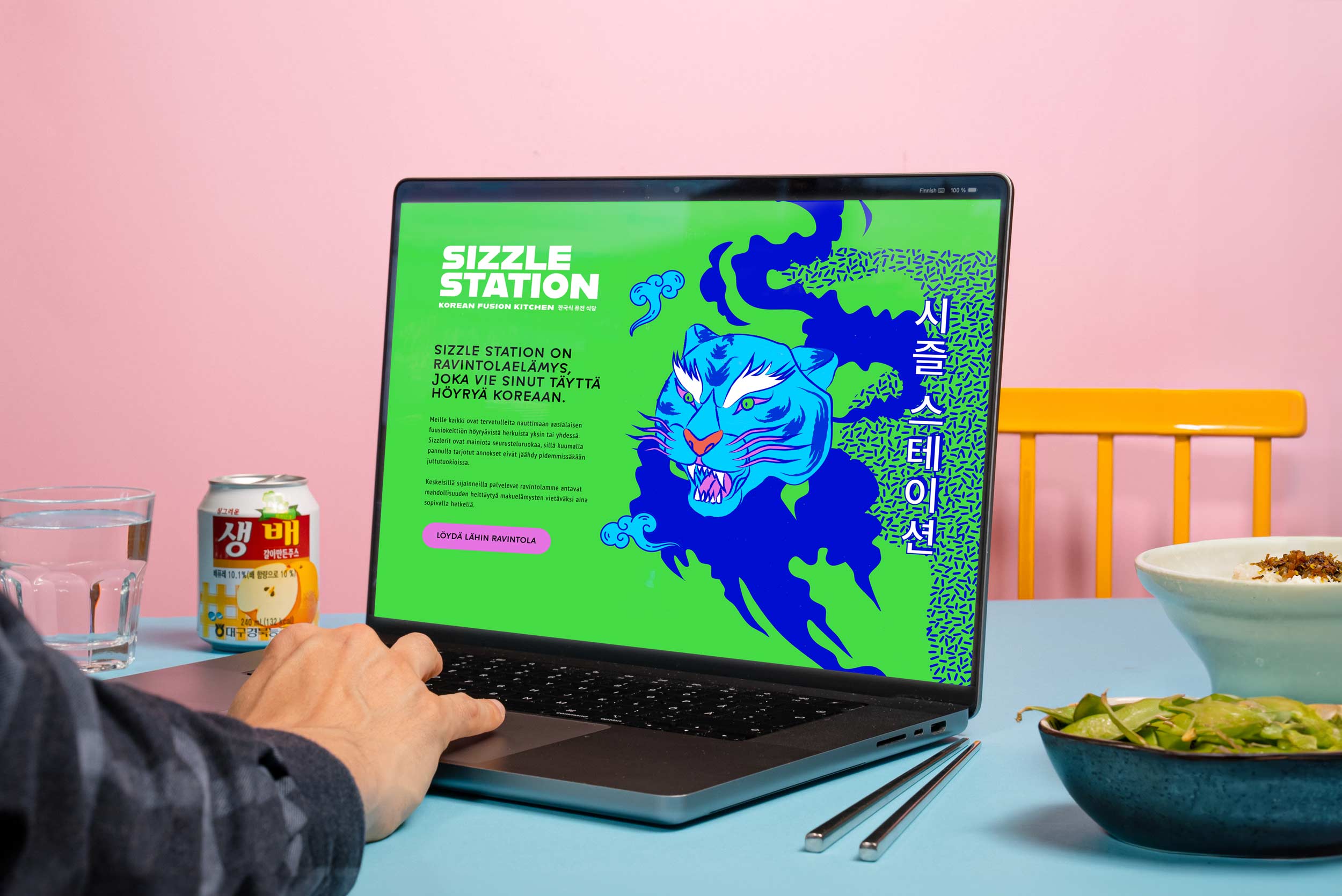
Sizzle Station
Visual and verbal identity for a popular Korean fusion kitchen restaurant chain.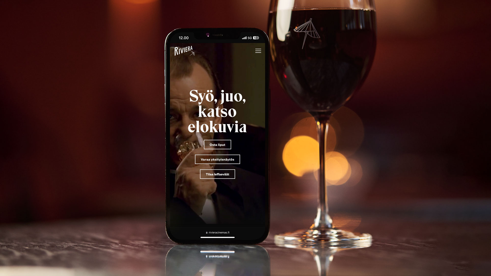
Riviera
A compelling website and booking system for a popular movie theater with a 5-star user experience.