Sizzle Station
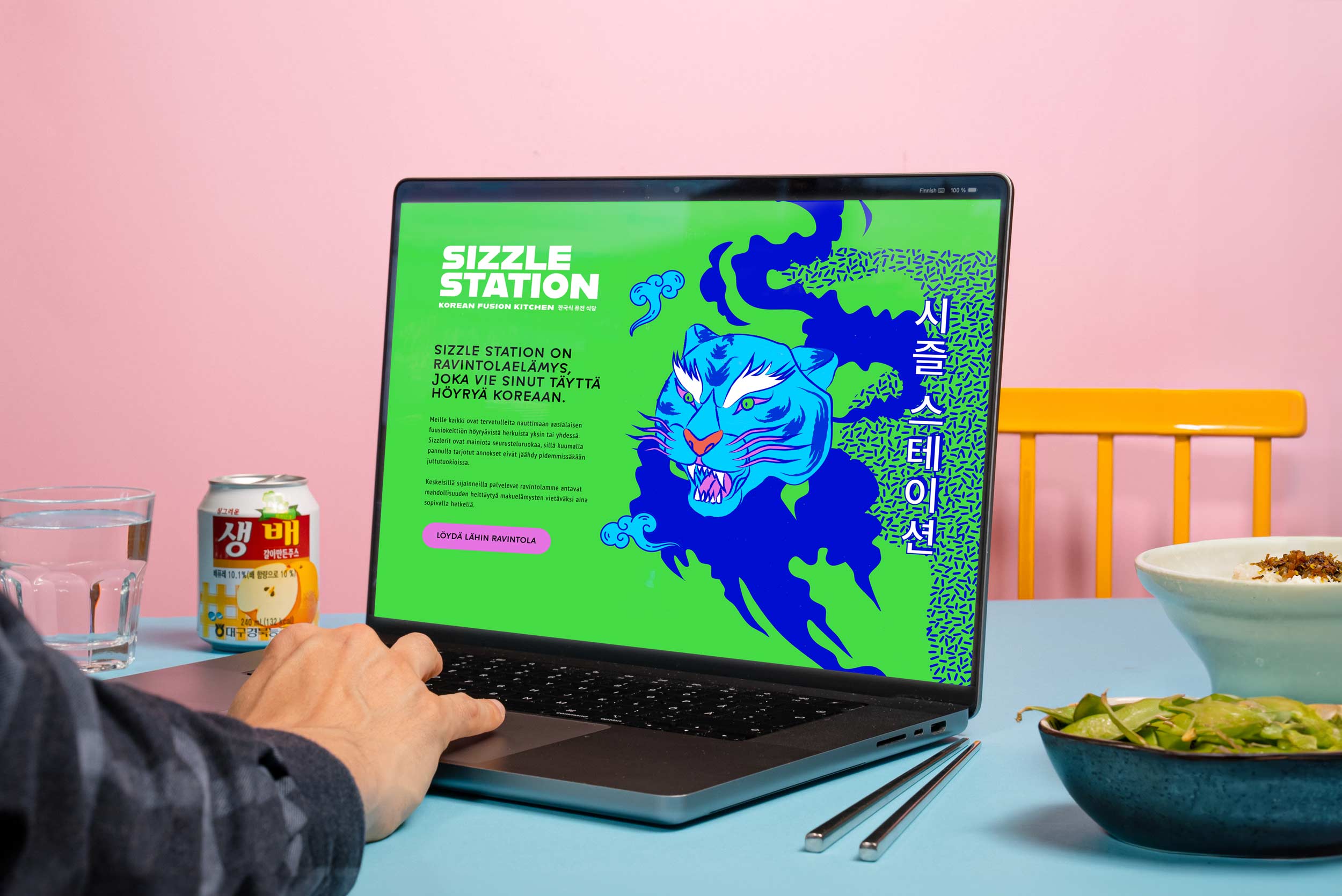
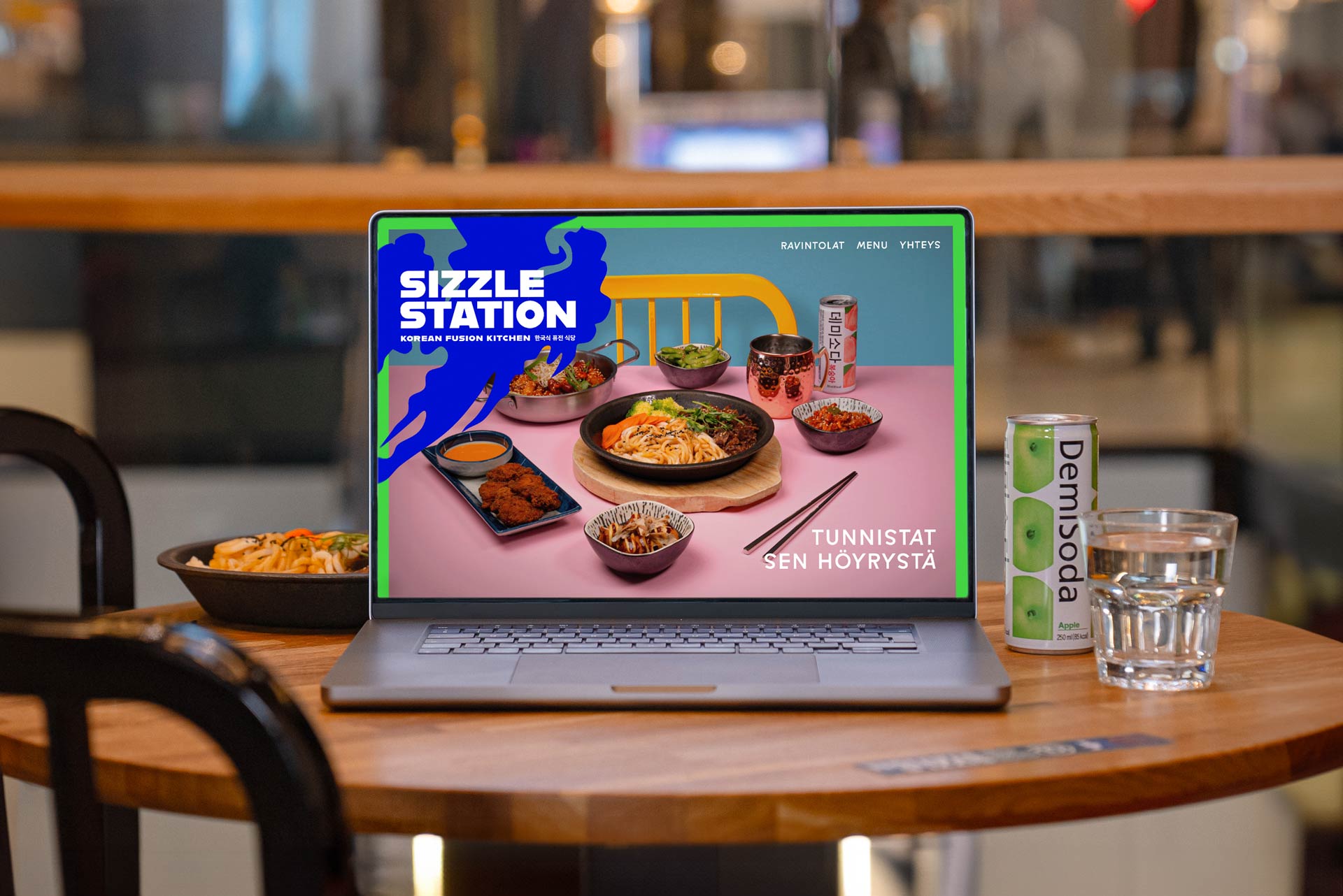
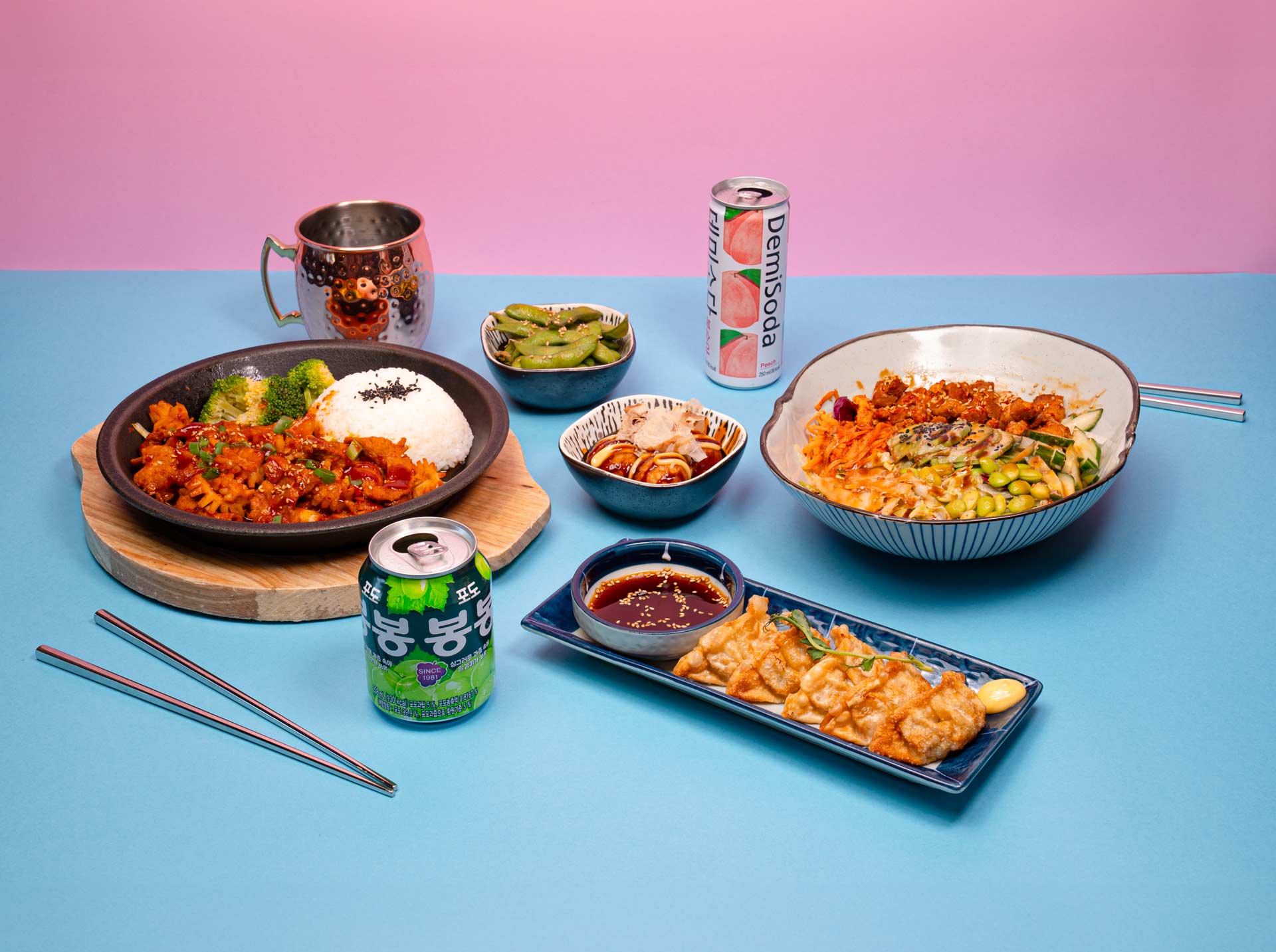
Sizzle Station is a popular restaurant chain that has been introducing Korean fusion kitchen to Finns for several years. New visual and verbal identity helped to crystallize the restaurant’s differentiating factor and communicate it in a memorable and experiential way.
Challenge
A brand without an image
Sizzle Station’s previous brand identity was created in a hurry, which is why it was not based on strategic choices. It lacksed a clear concept that ties everything together, which is the reason why the brand didn’t establish a strong, memorable image.
Korean food and culture are now more popular in Finland than ever before. However, the Korean background did not appear at all in the Sizzle Station brand. Diners visit Sizzle Station mostly at lunchtime, but interesting brand could also draw visitors in the evenings.
Solution
Every meal is worth the experience
On the basis of the visual appearance, it was important to create a concept that holds everything together, a sharpened distinguishing factor and crystallized selling points. This ensures that the brand and its messages are communicated to customers in a clear and appealing manner. The renewed brand had to be exotic, modern and colorful, but at the same time easily approachable, as the goal is to expand the restaurant chain around Finland.
Given that hot sizzler portions offer a multi-sensory experience, this aspect was elevated as the unique selling point of Sizzle Station. To support that, we chose Korean elements that fulfill the promise of Korean fusion kitchen.
Implementation
A restaurant that takes you full steam ahead to Korea
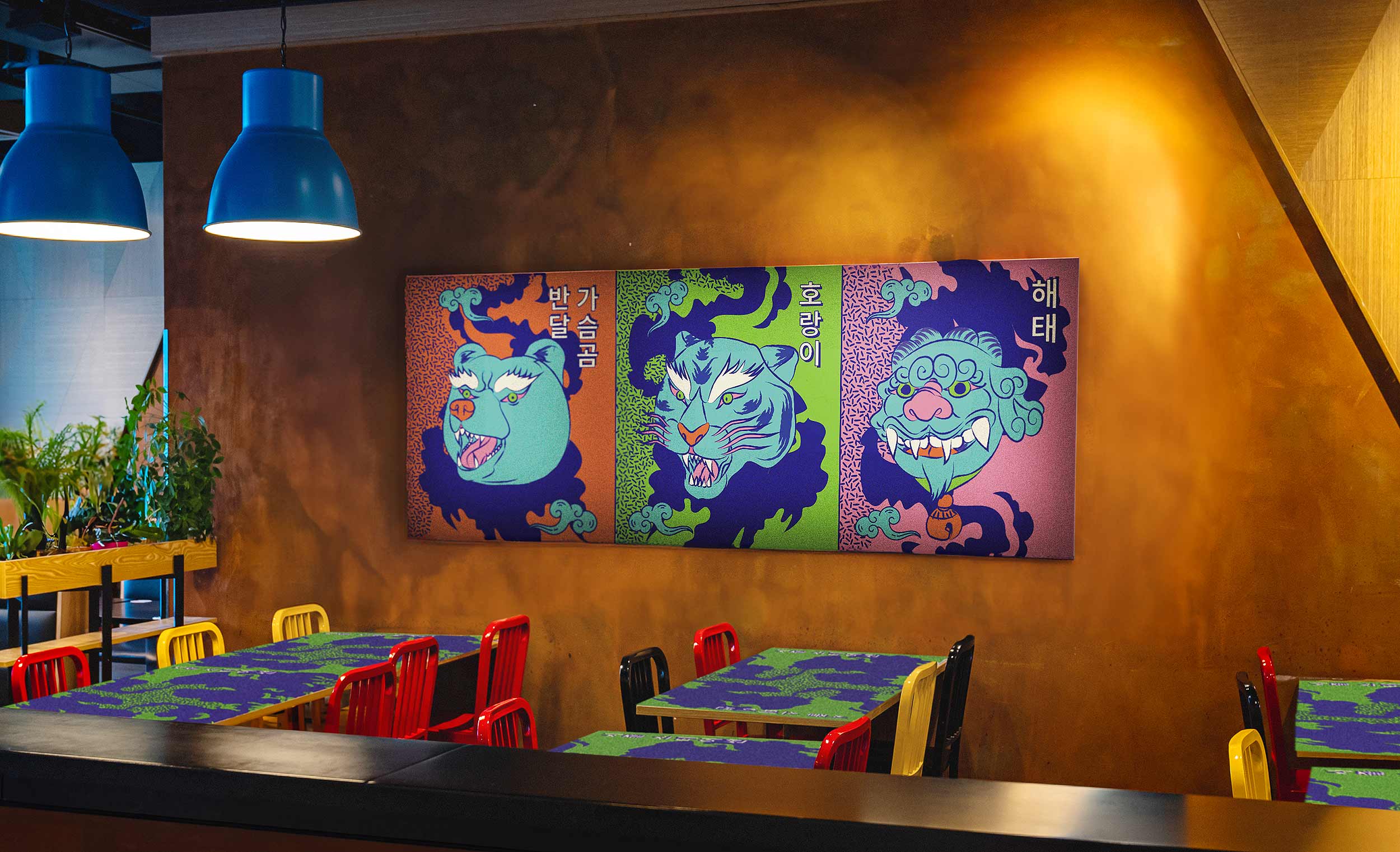
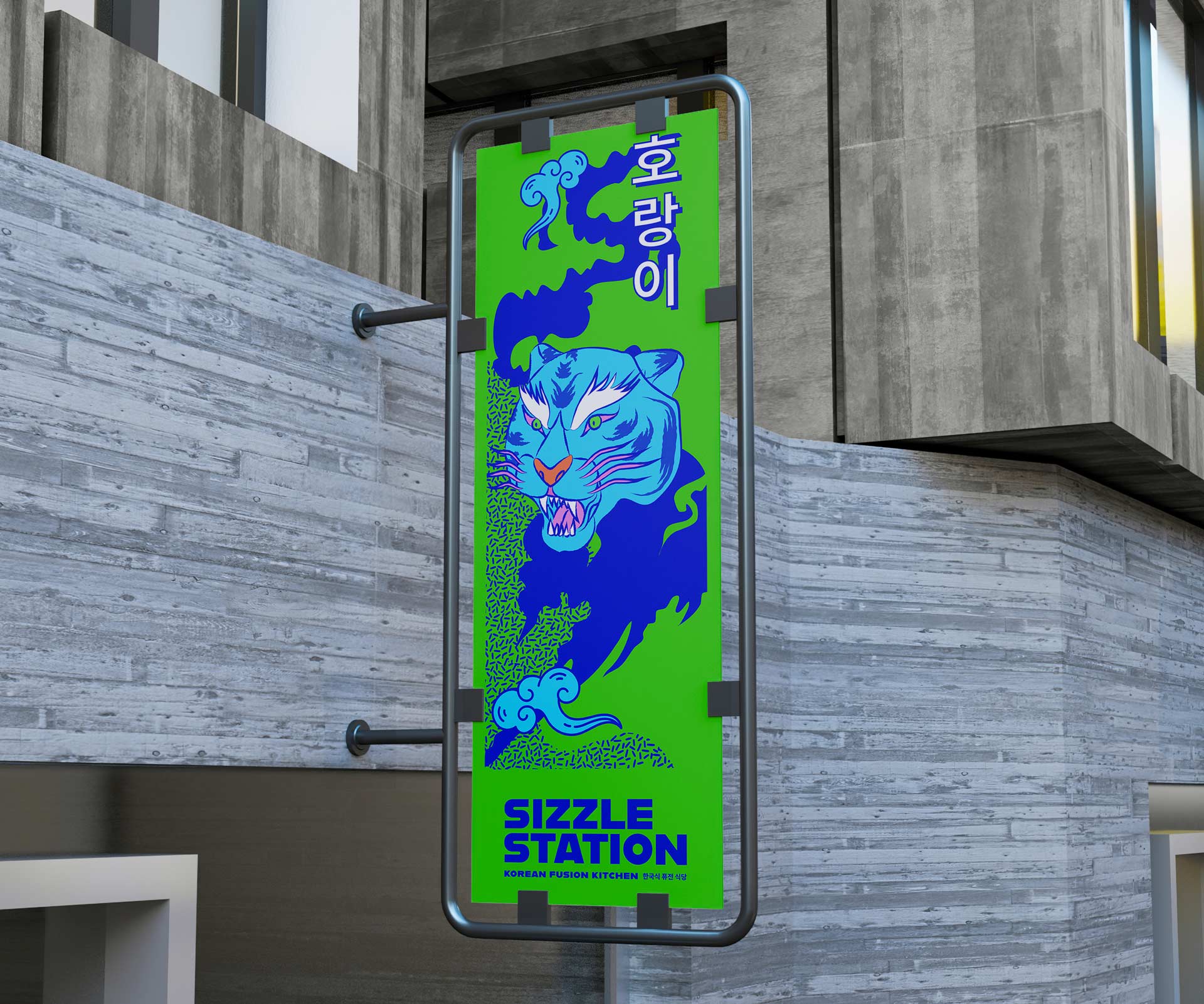
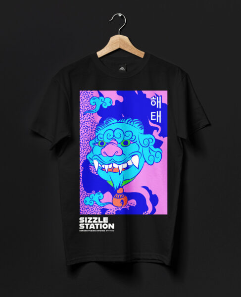
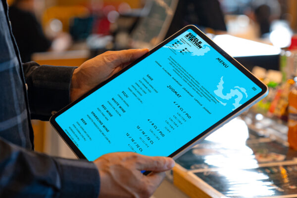
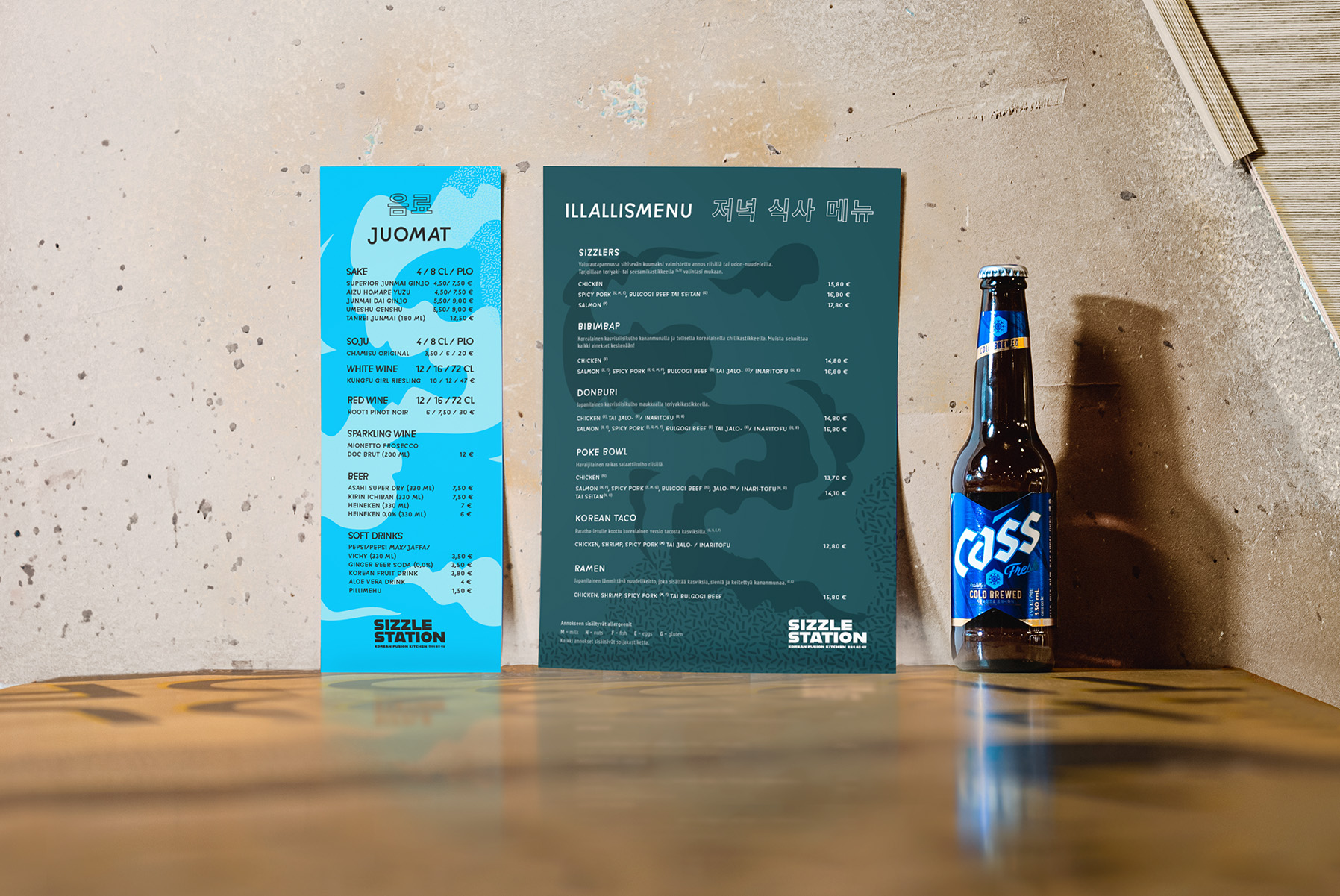
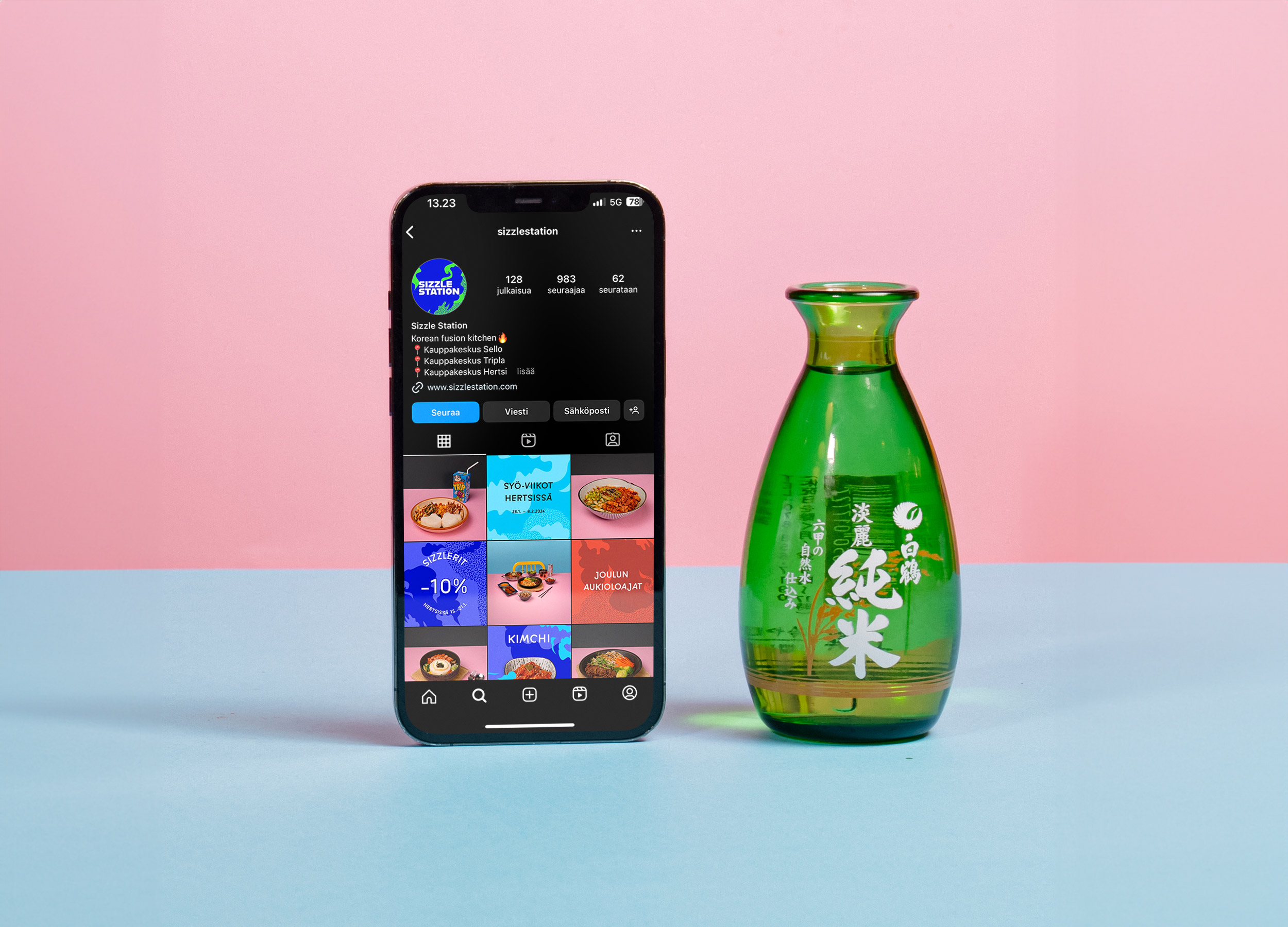
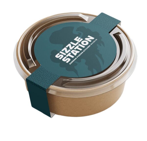
The renewed brand identity is inspired by Korean folk art, which is served to Finnish consumers in an easily approachable form. Animal figures familiar from Korean mythology and bold colors are a central part of the visual identity. The use of Korean letters and the vertical writing method further enhance the brand’s image.
Steam is a key part of Sizzle Station’s brand, as the restaurant’s signature dish is hot sizzler pot. The slogan “You recognize it from the steam” combined with the steam pattern connects the verbal and visual look and strengthens the brand identity.
Get in touch if you wanna know more about the reference:

More references

Rinnekodit
Multi-channel campaign concepts, video and photo shoots, and brand animations for a social enterprise providing social and healthcare services.
Renta
A multisite solution covering the sub-sites of the Nordic countries for a pioneer in the machine rental industry.
Hybridiarena Hype
Brand identity, marketing, website, booking calendar and online purchase platform for an experience arena in Espoo.
Gilda
Brand identity, website, ticket sales system and marketing for a movie theater.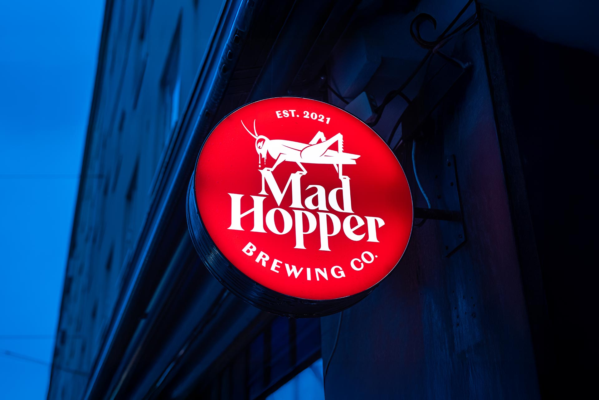
Mad Hopper
Brand identity, website and product launch for a brewery in Helsinki.